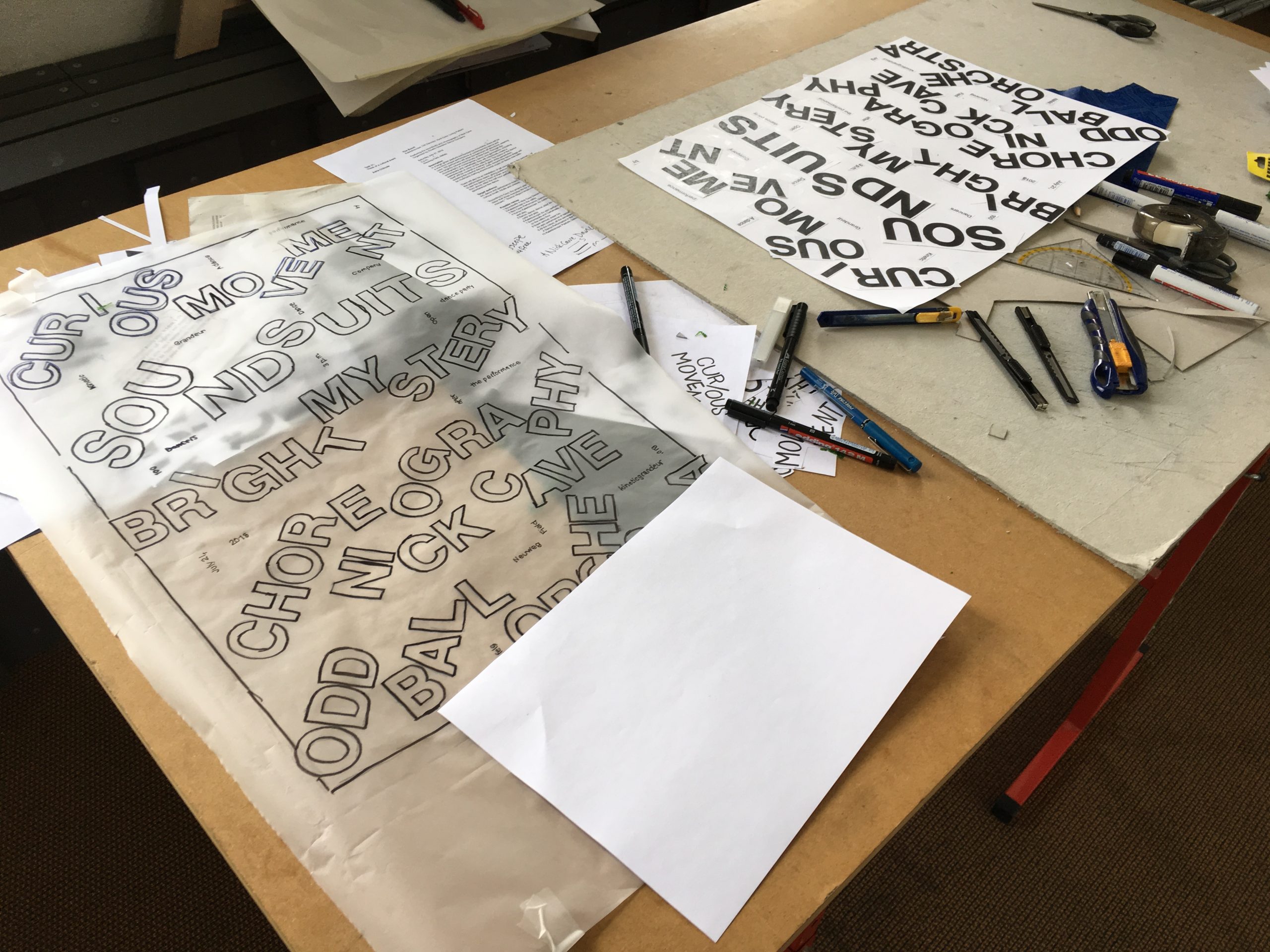
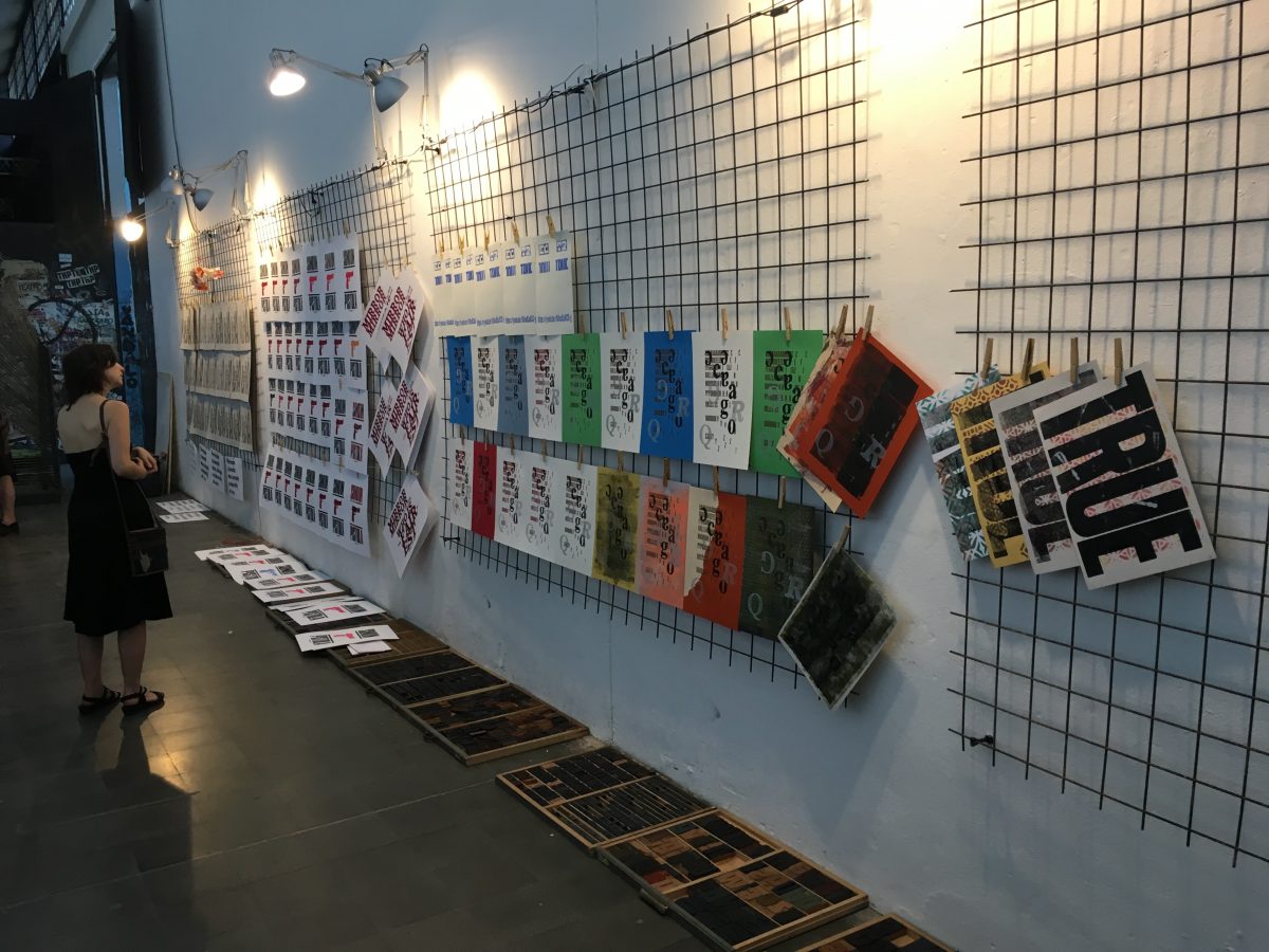
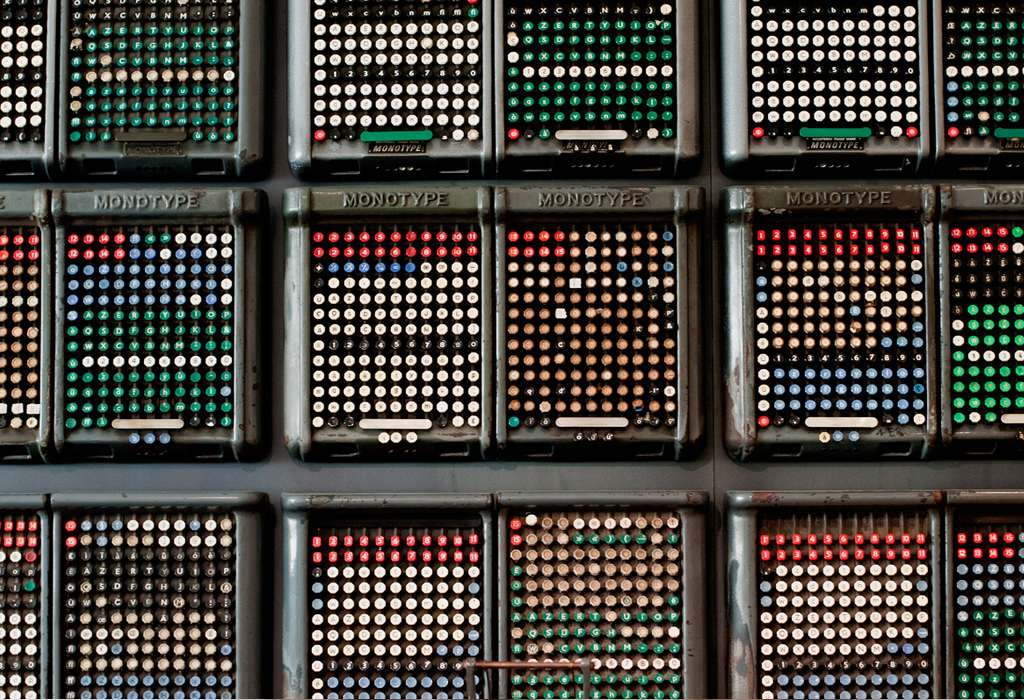
Because it’s sometimes easy to forget ourselves, here’s an attempt to list all the artists, authors, poets, designers, comedians and scientists we’ve been fortunate enough to make work with over the years:
A
Ad Vingerhoets – Forme 03: Tearful
Adisa – Hackney Libraries
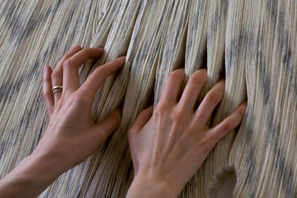
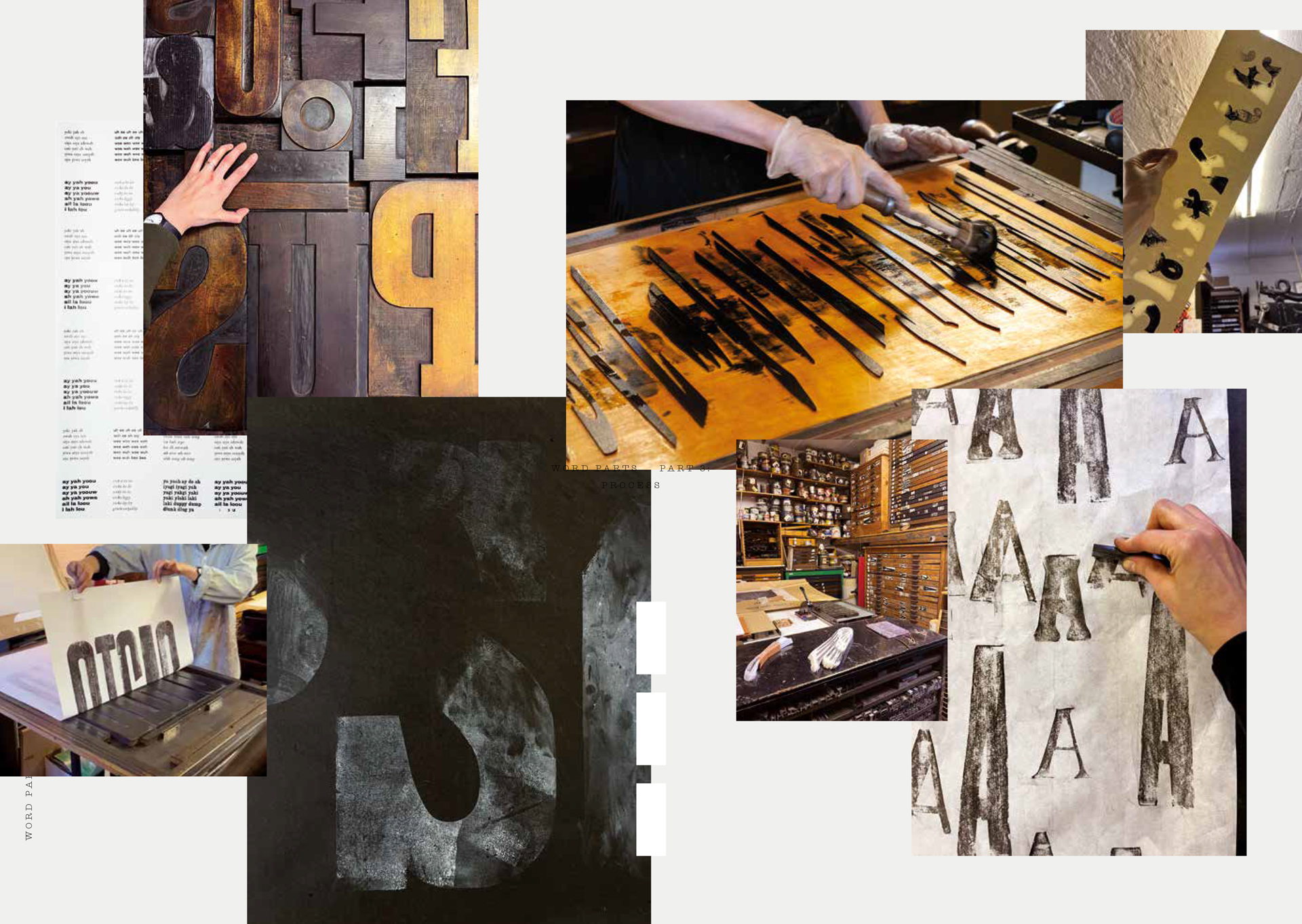
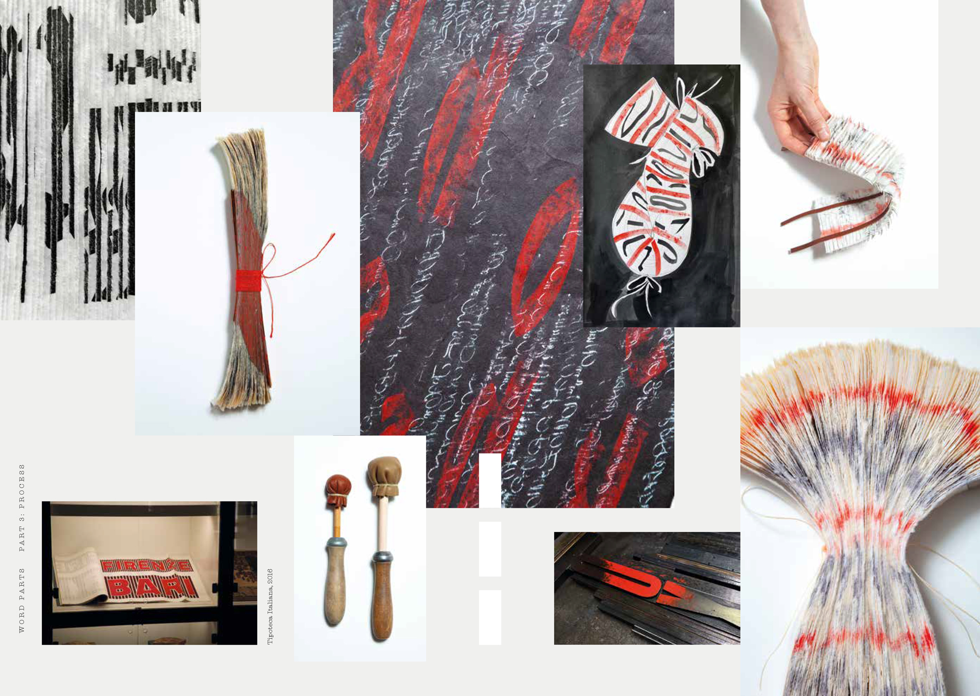
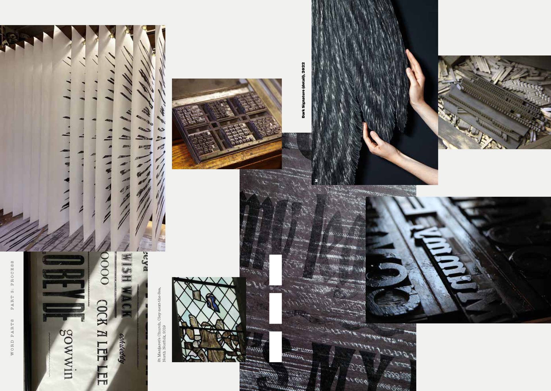
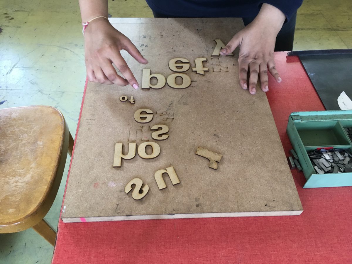
Alida Kuzemczak-Sayer – Word Parts
Amida Dean & Aantu Waday – Don’t Judge Me
Ana Maria Pacheco – Gargantua and Pantagruel
B
Beatrice Bless – Hagamos un Trato
Betty Lewin – Imperatives of Youngness
Bob and Roberta Smith – Dear Bob
C
Catherine Dixon – Characters of Note
D
David Pearson – Indispensible E
E
Extinction Rebellion Art Group – Boulots de Merde, Fairness, Rebel/Create
F
Fraser Muggeridge – Sexy of body, yet scared of the swinsuit
G
Gabriel Gbadamosi – Valediction, The Second Life of Shells
Gabriela Giga-Boy – Forme 02: Curses
Greg Nay (& Lisa Kane) – The Riverman
H
Hamish Fulton – No Talking for Seven Days
Heart n Soul – Against Racism, No Abuse, Put Phone Away, Stop Universal Credit, Walk Next to Me
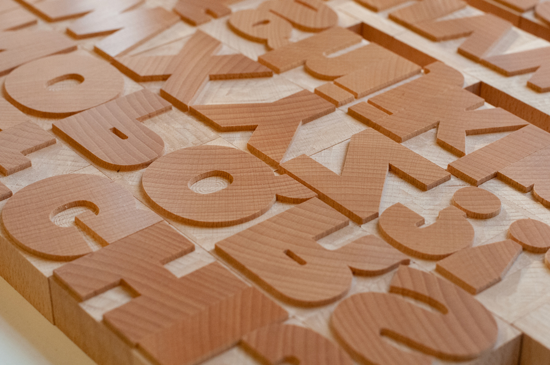
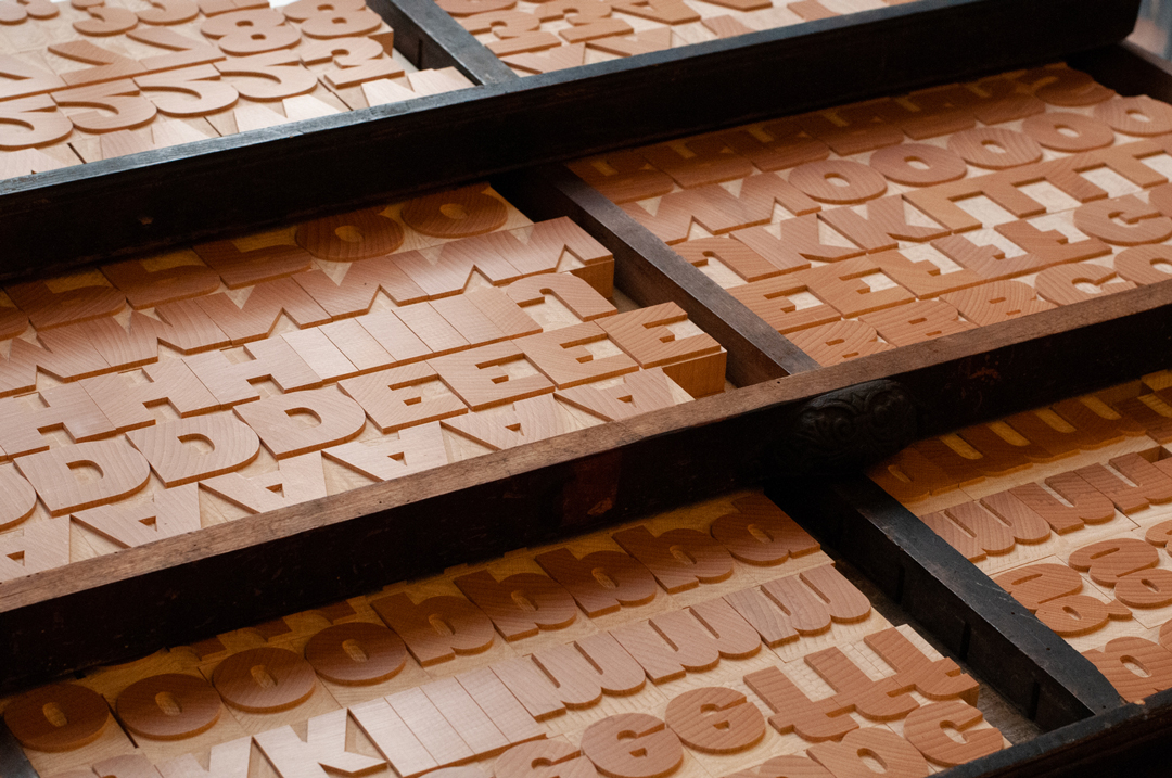
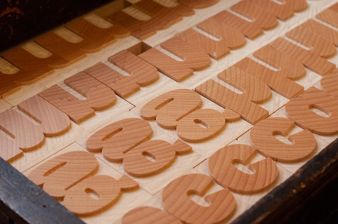
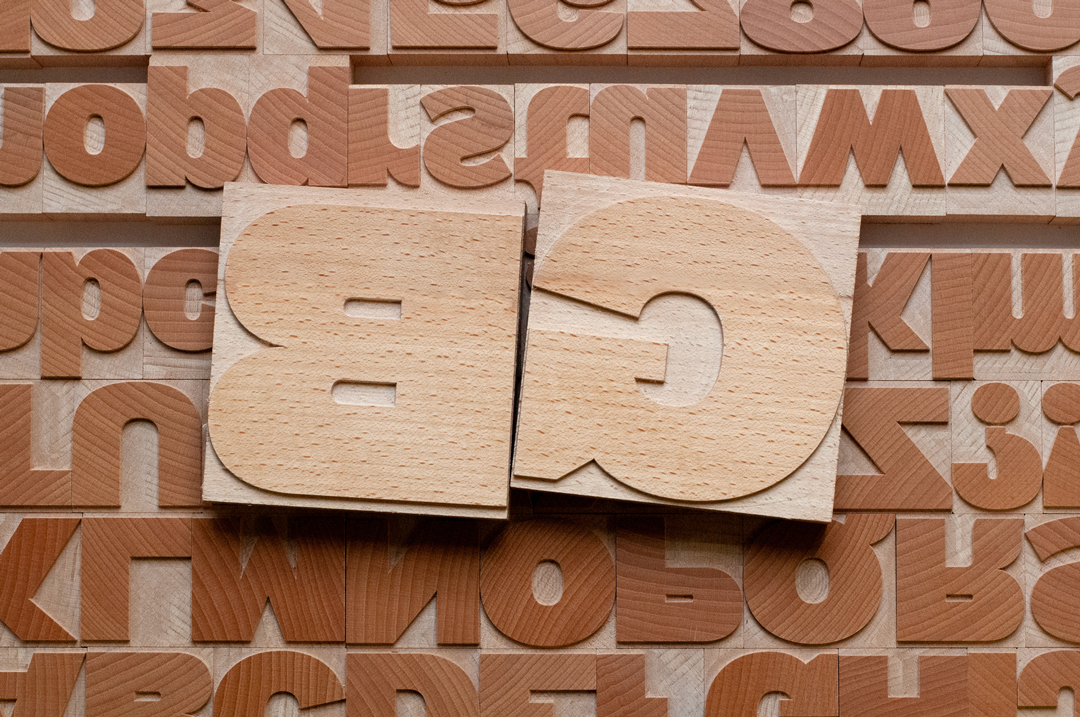
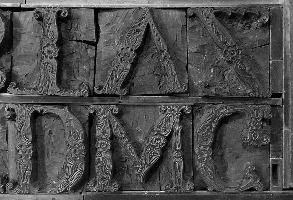
Henrik Kubel (& Scott Williams, A2-Type) – A23D: a 3D-printed letterpress font, GB: a new woodtype font
J
Jane Plüer – Yes, panic
John Anstiss – My Now and Then, The Extinction Will Not Be Televised
Jolyon Fox – Boring, Denied
K
Katherine Hamnett – Save the Earth
L
Lisa Kane (& Greg Nay) – The Riverman
Lisa Rahman – The Travelling Barmaid
M
Mandy Bonnell – Lamu, The Second Life of Shells
Malcolm Garrett – F for Fact
Marcus Vergette – Between the West Wind and Yellow Clay
Mark Titchner – It is you I still love the most
Mona Arshi – Eggs (from Somebody Loves You)
N
Neil Garrett – Forme 01: Untruth
Nigel Bents – The Cockney Alphabet, The Letterpress Manifesto
O
OPX – Prefix/Suffix
P
Peter Ashton Jones – An Exploration of a Railway Tunnel, No Algoithms Here
Peter Dean – Being for the Benefit of Mr Kite, Stephen Hawking’s Time Travellers Invitation
Peter Kennard – Another World is Possible, Sell/Bomb/Refuse, Visible/Invisible
Phil Baines – Willesden High Road in 1958
S
Sarah Boris – Untitled
Scott Williams (& Henrik Kubel, A2-Type) – A23D: a 3D-printed letterpress font, GB: a new woodtype font
Stevey Scullion – When We Face Faces, Silent Protest
Stewart Lee – Boris_Johnson, You Can Prove Anything with Facts
T
Tim Rich – Landfall
V
Vikram Seth – Minterne 1768; 2007