Internships from overseas

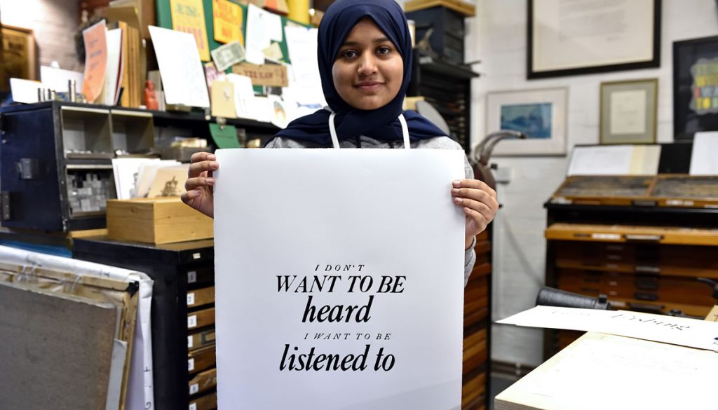
On the 22nd August 2022, whilst on holiday in France, I visited La Métairie Bruyère, Centre for D’Art Graphique, a beautiful countryside setting for all things print, including a large letterpress workshop. During the visit I met students setting and dissing type and talked to them about New North Press. As we were leaving one student rushed up to ask if she could do an internship with us after graduating and, although I made no promises, I said I would give it some thought.

For 20 years or more I have taken interns from Europe in both NNP and my paper conservation business. But since Brexit this had been made virtually impossible. I won’t go on about the stupidity of Brexit here, only to say that students from all over Europe were immediately stopped from coming to the UK. For the students that had been able to visit during those earlier years I know it had been a fantastic experience. And it was a mutually beneficial exchange, enriching the ideas and practice of both our visitors and the people that work with me in the studio. It was a gain for them, a gain for us and a gain for the UK. But all this ended after the 24th June 2016.

Recently the EU asked to open dialogue on allowing 18 to 30 year-olds the opportunity of free travel to study in the UK. The answer from Prime Minister Rishi Sunak was a resounding ‘No’. At the date of writing, nothing about this looks likely to change for the foreseeable future.

So, a student from France coming to the UK for an internship presented a problem. Thankfully, following my French holiday I had been able to arrange an intern from the USA – she spent three months in paper conservation and two months in letterpress* – which had been supported by BUNAC, an organisation that has been helping with student placements around the world since 1962. They do a fantastic job of removing the stress for the applicant, sorting out visas and all the paperwork. I recommend them – look them up and apply!

I had kept in contact with the French student. She was determined to come to NNP and I was hopeful that we could find a way. Gradually, with the help of BUNAC, it was finally arranged and, on 4 March 2024, Anais Mazel arrived to start her internship!

For three months Anais worked with great enthusiasm and diligence, carrying out a detailed wood engraving, lino-cuts and letterpress posters. She also single-handedly typeset 30 poems and assisted in day-to-day tasks, such as dissing type and sorting spacing material and furniture. She was fun, a great team member and will be missed. We are also certain that, on returning to France, she will do extremely well in her profession.

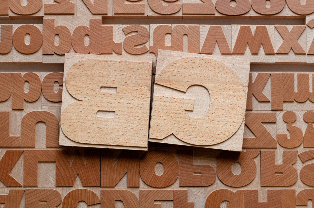
GB

*Letterpress and paper conservation, when studied in conjunction, offer an in-depth understanding of paper as a material, its qualities, tolerances and the effects of aging.
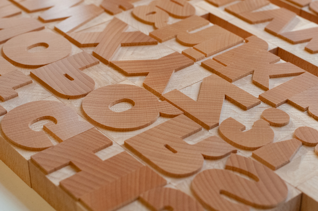
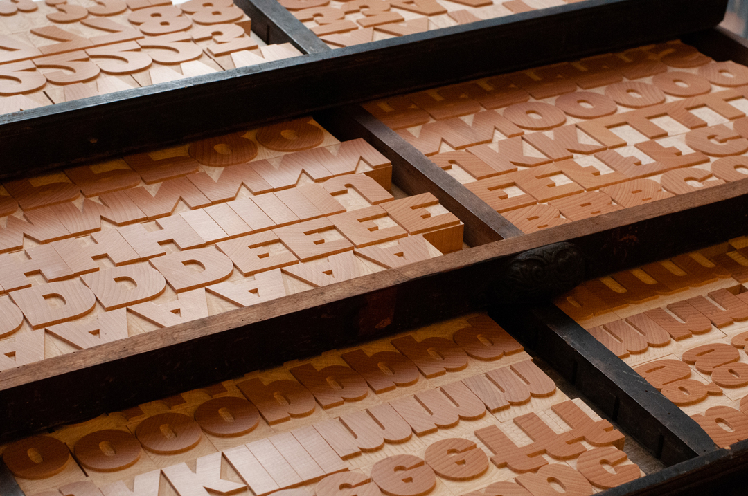
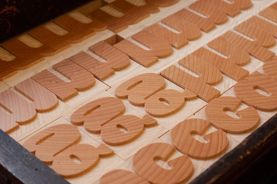
GB: a new woodtype font

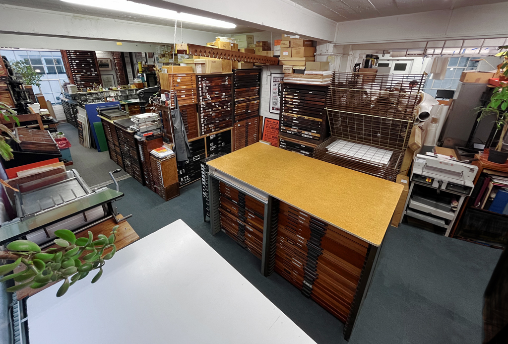
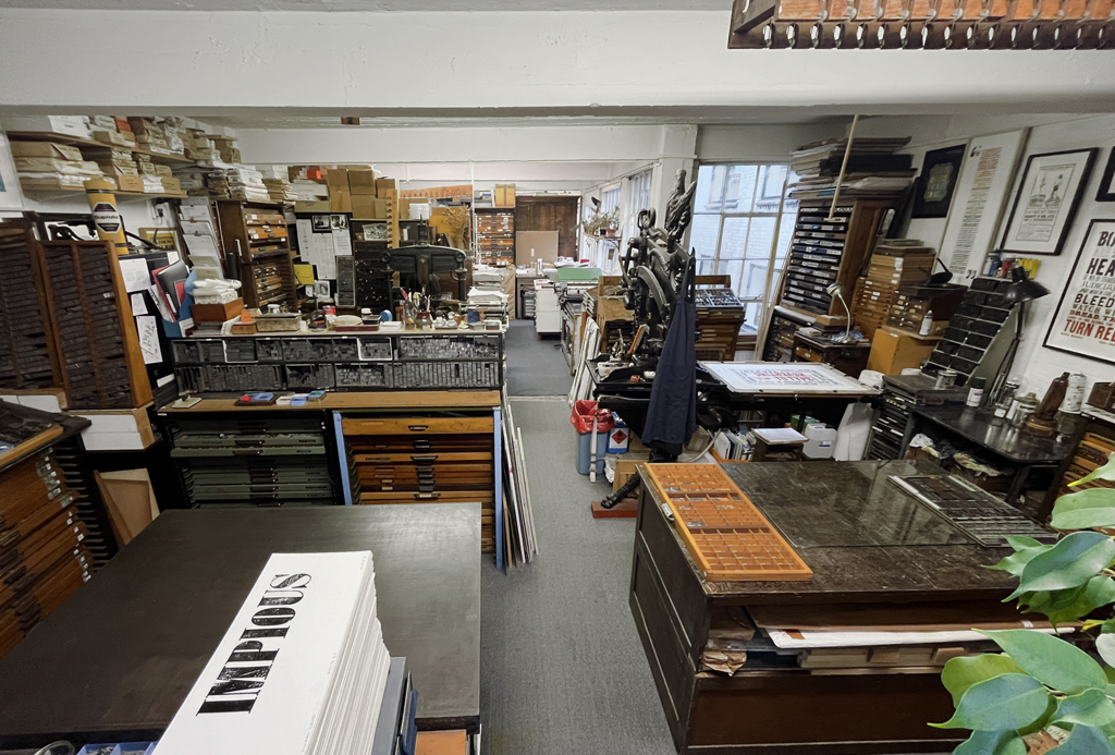
We’re extremely grateful to Henrik Kubel & Scott Williams of A2-Type – designers of A23D, our 3D-printed letterpress font – for donating a physical version of their digital font GB, to the New North Press type library.

On a visit to the studio, Henrik described how the design had been inspired by two single capital letters (G & B) found in the Morgan Press Type catalogue, a publication from 1970 billed as representing ‘a complete showing of American wood-type styles from 1826 to the present’. From these two letters – co-incidentally also the initials of NNP founder Graham Bignell – and wider research into historical letterpress woodtype specimens he managed to craft a font that is ‘a striking balance of tradition and modernity’. This has already been recognised in an award for typographic excellence from Type Directors Club Tokyo.

The font was expertly manufactured by Type High Design and we can’t wait to put it to work, in our projects and for use by anyone attending our classes.

Collaborators index

Because it’s sometimes easy to forget ourselves, here’s an attempt to list all the artists, authors, poets, designers, comedians and scientists we’ve been fortunate enough to make work with over the years:

A
Ad VingerhoetsForme 03: Tearful
AdisaHackney Libraries
Alida Kuzemczak-SayerWord Parts
Amida Dean & Aantu WadayDon’t Judge Me
Ana Maria Pacheco – Gargantua and Pantagruel

B
Beatrice Bless
Hagamos un Trato
Betty LewinImperatives of Youngness
Bob and Roberta SmithDear Bob

C
Catherine Dixon
Characters of Note

D
David Pearson
Indispensible E

E
Extinction Rebellion Art Group
Boulots de Merde, Fairness, Rebel/Create

F
Fraser Muggeridge
Sexy of body, yet scared of the swinsuit

G
Gabriel Gbadamosi
Valediction, The Second Life of Shells
Gabriela Giga-BoyForme 02: Curses
Greg Nay (& Lisa Kane)The Riverman

H
Hamish Fulton –
No Talking for Seven Days
Heart n SoulAgainst Racism, No Abuse, Put Phone Away, Stop Universal Credit, Walk Next to Me
Henrik Kubel (& Scott Williams, A2-Type)A23D: a 3D-printed letterpress font, GB: a new woodtype font

J
Jane Plüer
Yes, panic
John AnstissMy Now and Then, The Extinction Will Not Be Televised
Jolyon FoxBoring, Denied

K
Katherine Hamnett
Save the Earth

L
Lisa Kane (& Greg Nay)
The Riverman
Lisa Rahman
The Travelling Barmaid

M
Mandy Bonnell
Lamu, The Second Life of Shells
Malcolm GarrettF for Fact
Marcus Vergette – Between the West Wind and Yellow Clay
Mark TitchnerIt is you I still love the most
Mona Arshi – Eggs (from Somebody Loves You)

N
Neil Garrett
Forme 01: Untruth
Nigel BentsThe Cockney Alphabet, The Letterpress Manifesto

O
OPX
Prefix/Suffix

P
Peter Ashton Jones
An Exploration of a Railway Tunnel, No Algoithms Here
Peter DeanBeing for the Benefit of Mr Kite, Stephen Hawking’s Time Travellers Invitation
Peter KennardAnother World is Possible, Sell/Bomb/Refuse, Visible/Invisible
Phil BainesWillesden High Road in 1958

S
Sarah Boris
Untitled
Scott Williams (& Henrik Kubel, A2-Type)A23D: a 3D-printed letterpress font, GB: a new woodtype font
Stevey ScullionWhen We Face Faces, Silent Protest
Stewart LeeBoris_Johnson, You Can Prove Anything with Facts

T
Tim Rich
Landfall

V
Vikram Seth
Minterne 1768; 2007

Word Parts

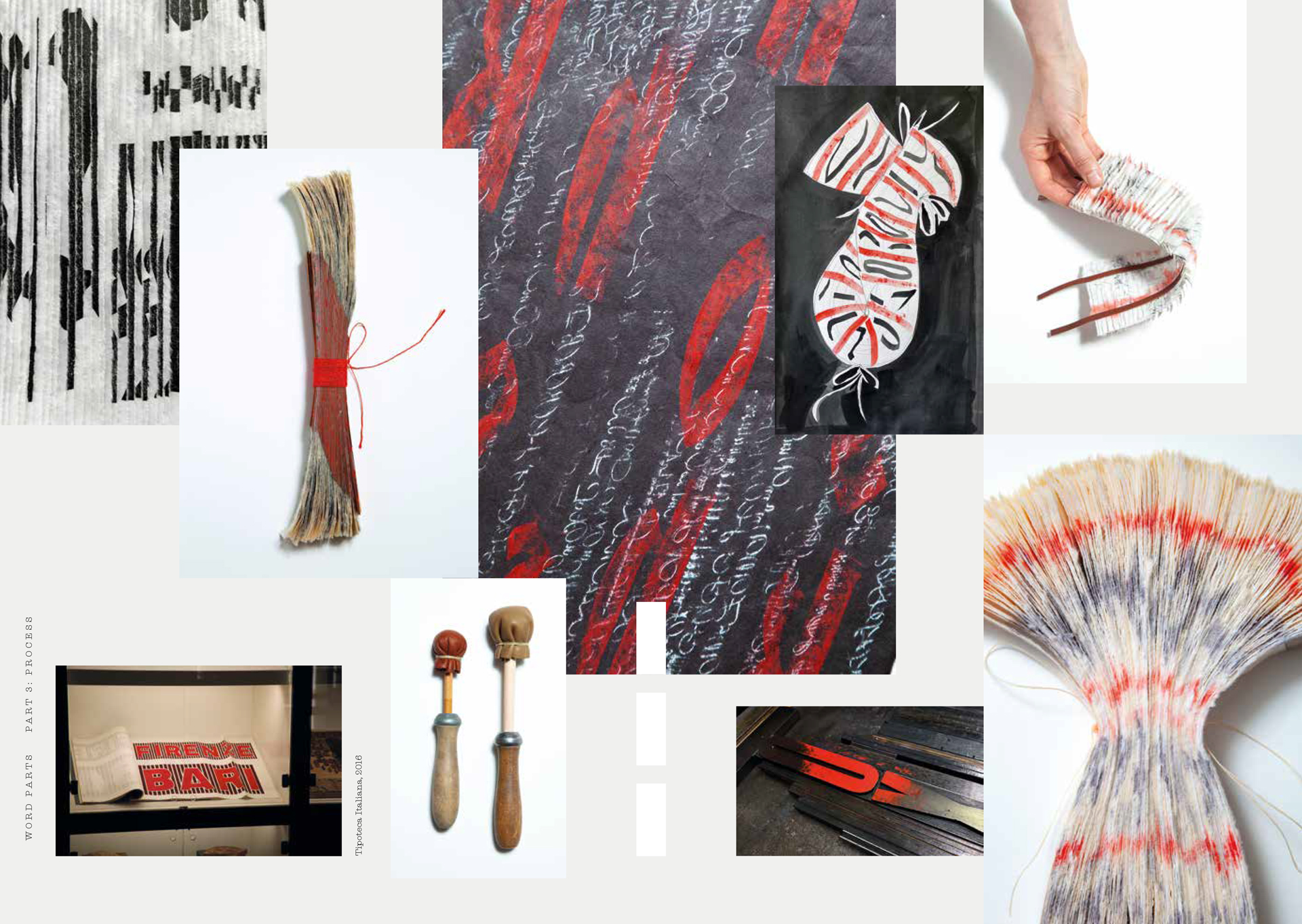
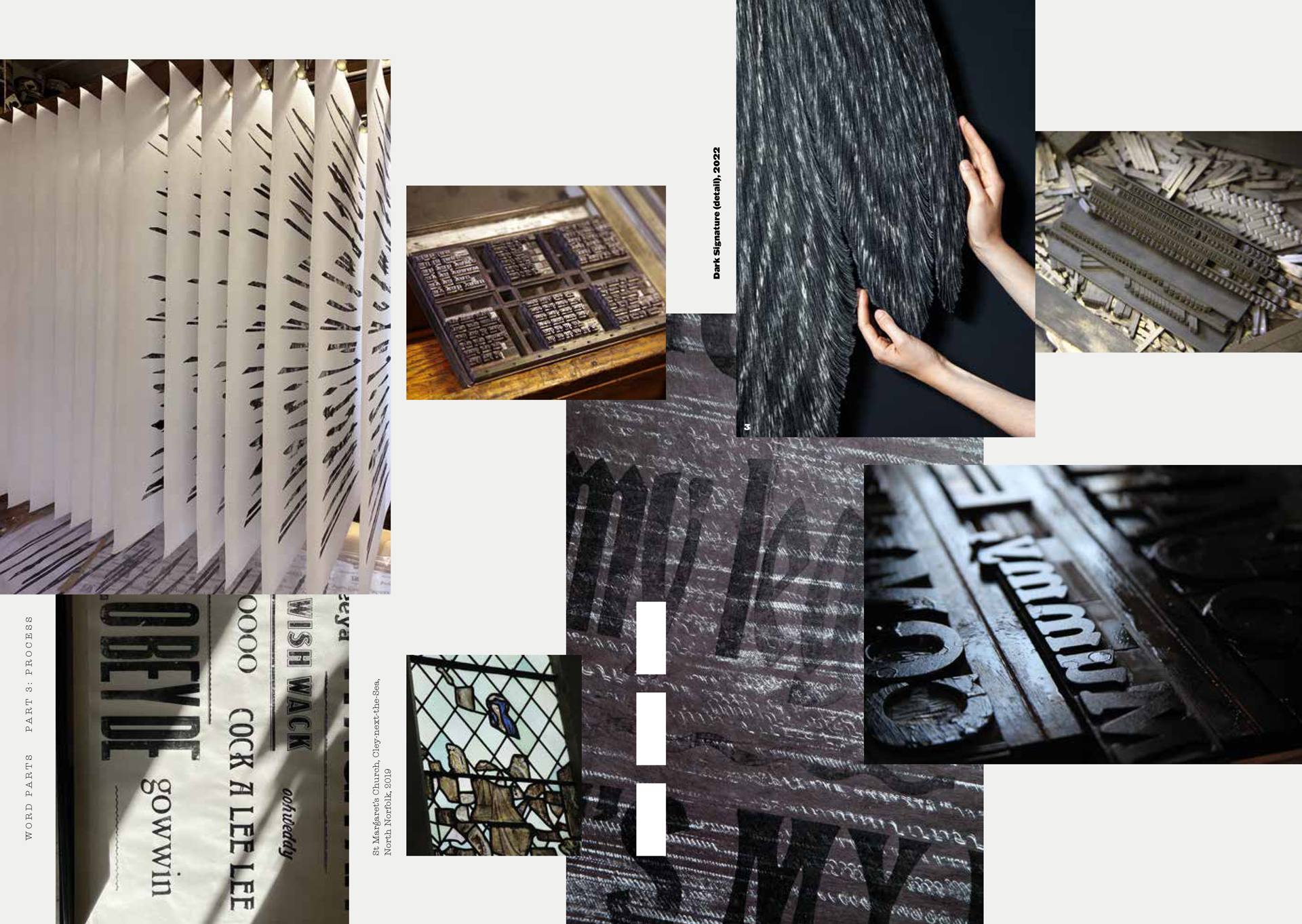
When you practice a craft, particularly one as rich in tradition as letterpress, it’s easy to fall into the trap of thinking that there’s only one way of doing things, and that straying away from the path known as ‘good practice’ defeats the purpose of the task. Over the last year, we’ve been collaborating with an artist who not only wanted to immerse herself in the history and techniques of printing (type, ink, paper, bookbinding), but also ultimately intended to deconstruct these traditions in order to create new forms.

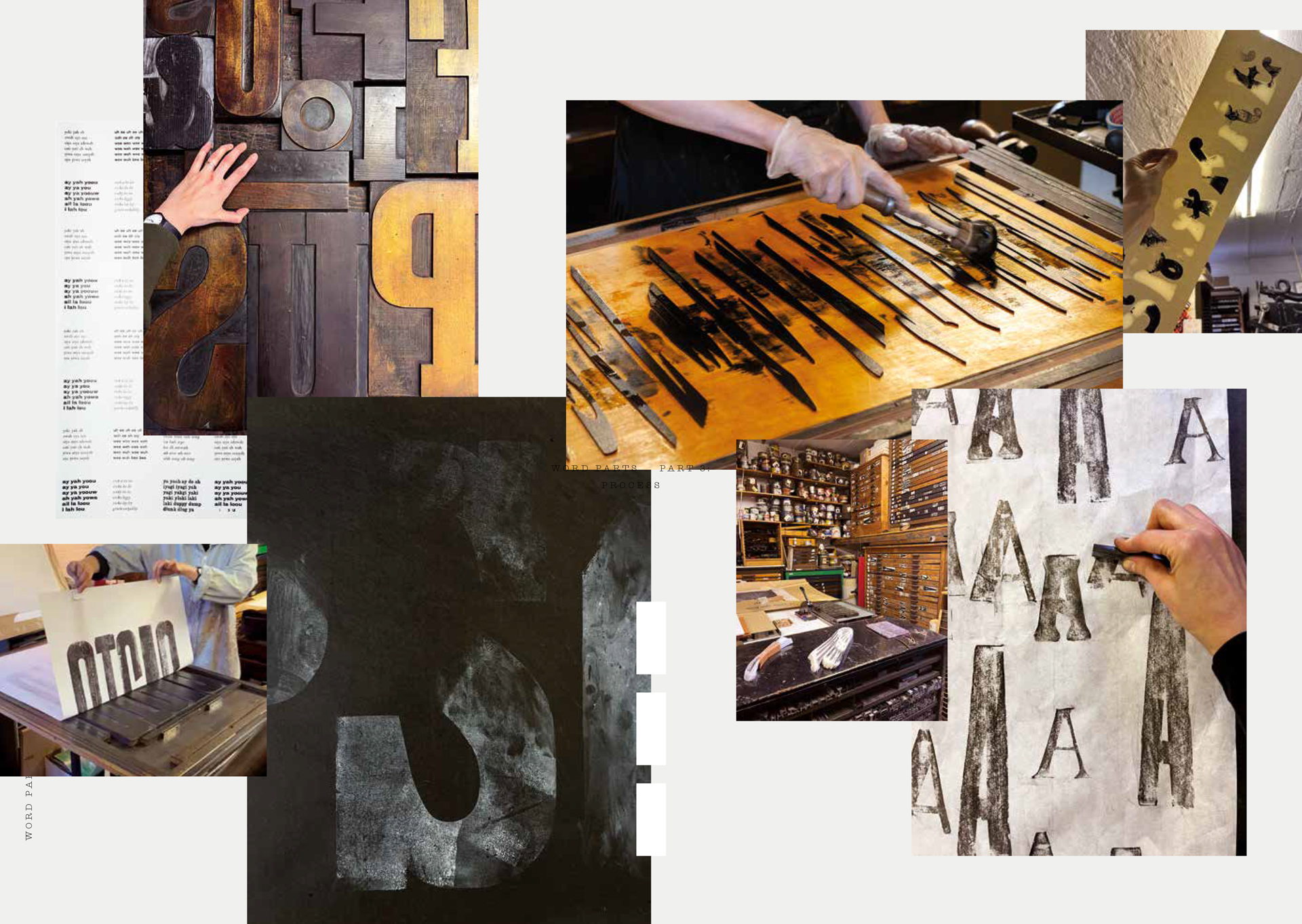
Despite having experienced letterpress during her time at Glasgow School of Art and the RCA, Alida Kuzemczak-Sayer was keen to begin by reacquainting herself with the press room: composing type, locking-up formes, inking and pulling the press. Having refamiliarised herself with these techniques, a freer form of investigation could begin. Experiments with paper – often kozo (a light-weight stock, hand-made from Japanese mulberry) – tested its ‘tearability’ as well as its printing surface. Rubbings were taken from metal type, particularly the flowing forms of the script fonts. The inked surfaces of wooden type was disrupted with a shower of white spirit and the paintbrush-like strokes of leather dabbing rods that Alida had made for the purpose.

Spreads from ‘Word Parts’ catalogue

Spreads from ‘Word Parts’ catalogue

Spreads from ‘Word Parts’ catalogue

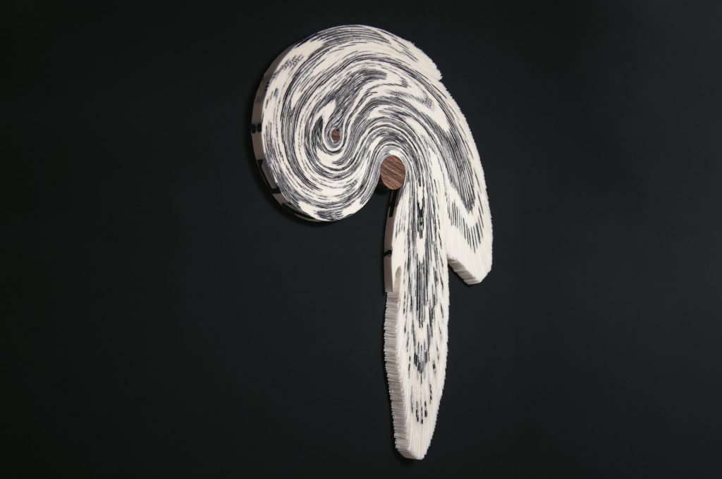
Eventually, the piles of printed sheets resulting from days of work that filled the studio’s drying racks would disappear, taken to Alida’s Norfolk studio to be reinterpreted. They would reemerge unrecognisable as awe-inspiring sculptures that play with the boundaries of the printed word. Setting out to use the tools of letterpress and respond to its traditions, while managing to create outcomes that feel original and unexpected is a formidable goal, but something that these artworks seem to do effortlessly.

The project culminates in Word Parts, an exhibition at Standpoint Gallery – an appropriate venue, being on the ground floor of the building that houses our studio where the works began to take shape – and was supported by Arts Council England and Henry Moore Foundation. New North Press has published a special catalogue to accompany the show.

It’s been a great pleasure to be involved in the project and we thoroughly recommend visiting the exhibition in person, and/or reading more about Alida’s work in the catalogue.

Word Parts
10 November – 9 December 2023
Standpoint Gallery
45 Coronet Street, London N1 6HD

All artworks and imagery by Alida Kuzemczak-Sayer. Photography by Philip Sayer.

The World Must Change

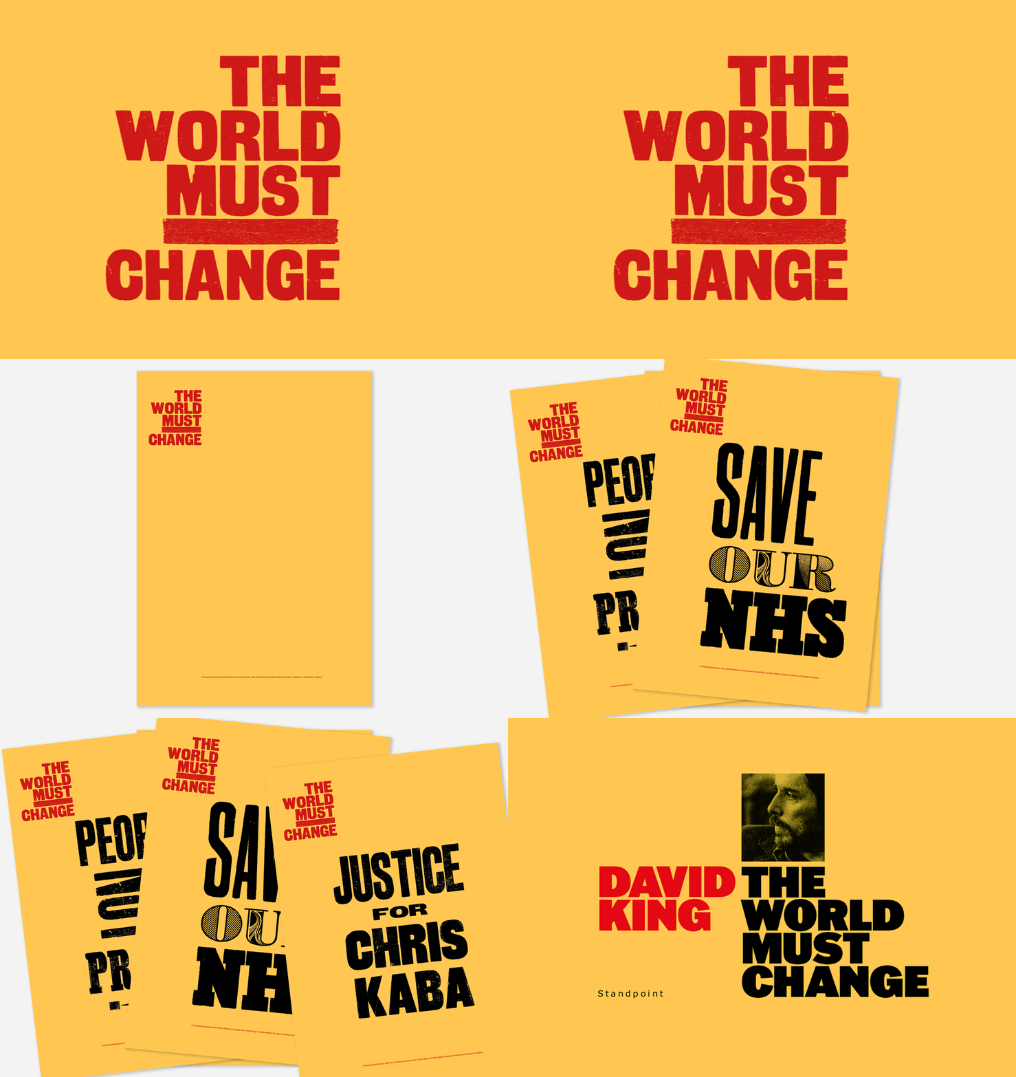
To coincide with the exhibition David King: The World Must Change at Standpoint Gallery (on the ground floor of our building) we will be running a series of special poster workshops on Saturday 15 October. Participants are invited to respond to the show’s title, using our woodtype to add their own protest lines to The World Must Change posters.

Saturday 15 October
Session 1: 10.00–11.30
Session 2: 11.30–13.00
Session 3: 14.00–15.30
Session 4: 15.30–17.00
Session price £30 per person, max. 4 tickets per session

From the late 1970s to the mid-1980s, the British graphic designer David King’s protest posters gave left-wing causes a powerfully persuasive new identity. His extra-bold designs for the Anti-Nazi League, the Anti-Apartheid Movement, the National Union of Journalists, and other organisations presented their messages with a graphic force and conviction that no one could ignore. King was a master of hard-hitting typography with an equally assured command of photography.

David King: The World Must Change
16 September–22 October 2022
Standpoint Gallery, 45 Coronet Street, London N1 6HD
Open Thursday–Saturday, 12–5pm. Admission is free.

More information about David King: davidkingdesigner.com
Curated by Rick Poynor. Exhibition designed by Simon Esterson.

Hoxton woodtype

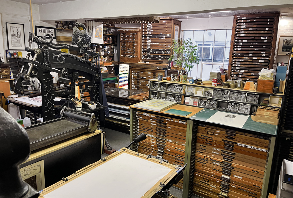
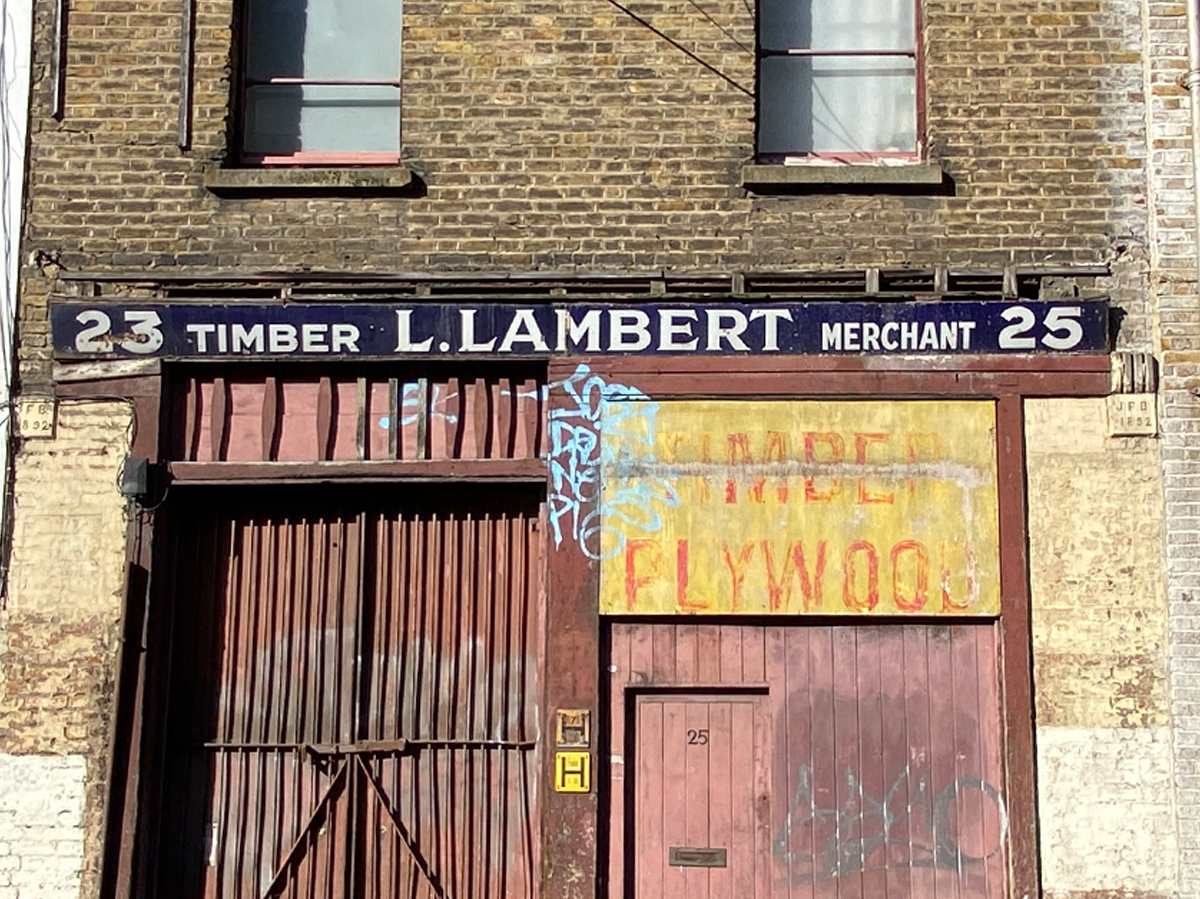
New North Press has been based in Hoxton, East London since 1986 but the area has had a long association with print and its related industries, in particular the manufacture of wood type.

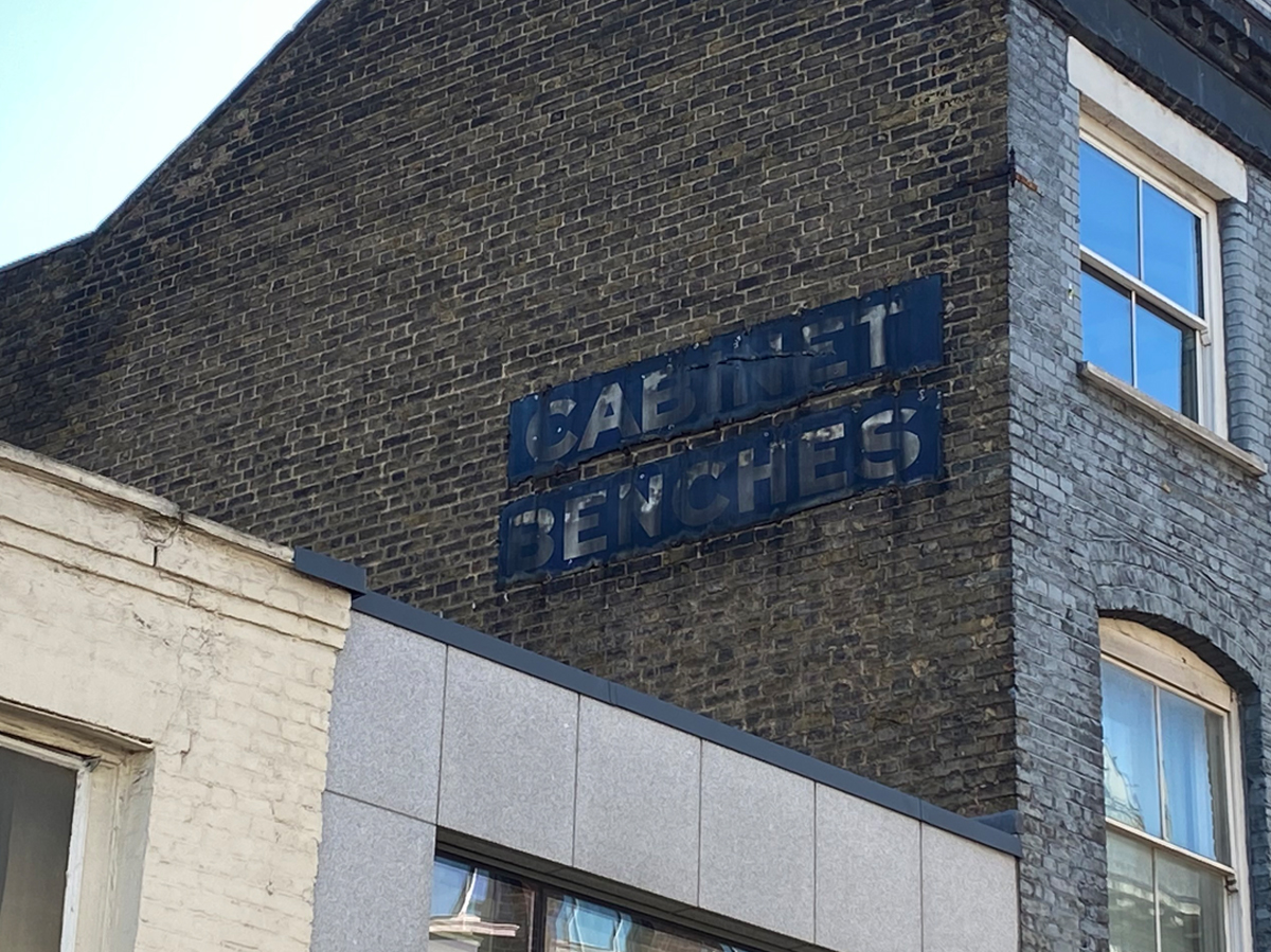
During the late 1800s Hoxton was renound for its furniture-makers and wood trades in general flourished in the area following the completion of Regents Canal in 1820 which provided an easily accessible supply of heavy materials and lumber. Some remnants of this industry can still be seen by those with a keen eye walking the area. It must have been a loud and busy place with many specialist trades such as veneering, French polishing, joiners, sawyers, turners and saw mill operators working alongside related industries like piano manufacturers and other skilled workers such as tailors, ironworkers, saddlers and cordwainers.

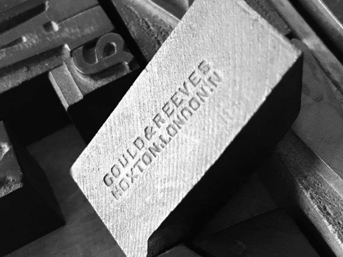
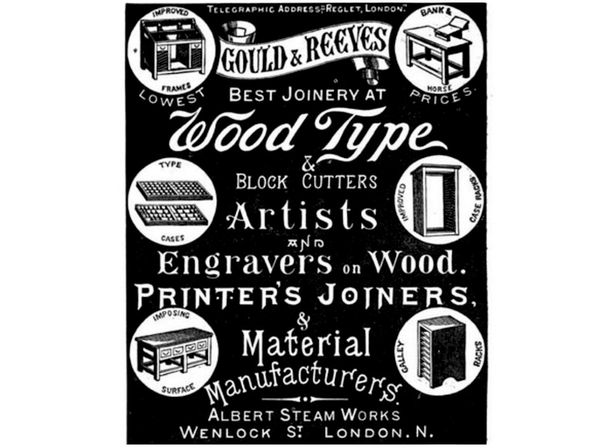
One ‘printer’s joiner’ of particular note were Gould & Reeves who operated from Wenlock Street from 1878 to 1904. As well as producing wood type, cabinets and print office furnishings they also offered engraving services for advertising (as this block for a ‘cure-all’ medicine in the V&A’s collection shows). Many others firms in the area will also have contributed to the booming print industry whose centre was just over a mile away at Fleet Street.

Needless to say we feel very fortunate to be based in an area steeped in the history of our craft.

With thanks to David Wakefield

Courtesy of David Wakefield, 23 Press

Reverting to Type 2020 – DATE CHANGE

Due to the global pandemic and its wide-spread effects we have decided to push the exhibition back to later in the year to allow more time for the making and sending of work. The show is now scheduled to take place in November and not July as originally planned. Thanks for bearing with us.

* Update 03.11.20
The UK Government has announced four weeks of national lockdown (5 November to 2 December) so, as the gallery cannot be open, we have had to move the the launch date back to the first week of December. And, as restrictions could go on for longer, we’ve also managed to extend the dates until the end of January 2021 to try and compensate. We’ve already had to delay the show once and don’t want to keep doing this so the plan is to launch in December, even if restrictions are still in place.

Letterpress Protest Posters

This summer we will be holding an exhibition of letterpress protest posters.

Marking 10 years since our last Reverting to Type exhibition, 2020’s show will be for artwork with something to say: sounding a warning signal about the global climate crisis; railing against fake news and surveillance capitalism; confronting fascism, sexism and racism; fighting for equal opportunities and inclusivity. As before, this will be an international exhibition showcasing progressive letterpress artwork from presses around the world, alongside the work of students and specially-invited collaborators.

Full information on how to register and submit can be found here:
letterpressprotestposters.artcall.org

This is an open invitation to anyone with access to a printing press so please help us by sharing the link above

National Saturday Club

We’re very proud to have been a part of the National Saturday Club again this year. Giving young people the chance to express themselves through letterpress is something we’ve always considered a duty at NNP and we never fail to be impressed by the passion and creativity in the results.

Former Education Secretary, Estelle Morris, quoted the excellent poster above during her speech at the Private View evening of the scheme’s Summer Show which is on at Somerset House, London until 16 June and is well worth a visit.

Photo: © Saturday Club Trust/Jo Mieszkowski

Tipoteca – Fibonacci print edition

The result of our trip to Tipoteca Italiana: a number-inspired edition of 400 poster/booklets. These prints use numerals to chart the history of the museum, its location (longitude and latitude) and pay tribute to Fibonacci, showcasing some lovely woodtype along the way! They can be purchased from the Tipoteca shop with all proceeds going to the museum.

Italian mathematician Fibonacci is famous for having transformed European culture by introducing the Hindu-Arabic numerals (1-9) and the concept of zero (which was treated with deep suspicion until this point) in the year 1202. The booklet’s structure is based around the Fibonacci Sequence (a series of numbers where a number is found by adding up the two numbers before it). The cover also features the typographic portrait of each of its makers in the form of the type height (in mm) of their country of origin.

A collaboration with John Christopher, Thomas Gravemaker, Sander Pinkse, Stéphane De Schrevel and Michael Karner.